
Clear. Concise. Consistent. These are the 3 C’s of UX writing and are 3 of the most important concepts a UX writer must understand in order to write great microcopy for their users.
Let’s take a closer look at each one:
CLEAR
ADJECTIVE
Easy to perceive, understand, or interpret.
Leaving no doubt; obvious or unambiguous.
Having or feeling no doubt or confusion.
Origin — Middle English: from Old French cler, from Latin clarus.
oxforddictionaries.com
“Clear” in UX writing means exactly the same thing as it would in any other context:
- Easy to understand
- Obvious
- Unambiguous
- Leaves no doubt
These are on the functional level.
- Having or feeling no doubt or confusion.
This is on the emotional/experiential level.
Ok, that’s just the definition.
But why is it so important?

Why does your microcopy need to be clear?
Microcopy is all the words that help users understand interfaces and take action. It guides them by communicating in their language.
When your microcopy is not clear:
- Users will have to work hard to understand it, and achieve their goals.
- They will get confused.
- They will go down the wrong path (the unclear microcopy will mislead them).
- They will have a bad experience.
No one likes feeling confused, being mislead, or having to work hard to get what they want (from a product).
It leads to negative emotions towards the product such as:
- Frustration
- Alienation
- Mistrust
All of these are the exact opposite of what you want.
When your microcopy is clear your users will:
- Understand quickly and with ease
- Get where they are going fast with no stress
- Achieve their goals
- Experience satisfaction
WIN-WIN for your users and your product
Ultimately, an experience results in an emotion.
Microcopy must be clear to help give your users what they want and what they need to experience satisfaction, which is a positive emotion.
Satisfied users will return to buy, share, interact, sell… all the things you want them to do!
How to create clear copy every time:
1. Research your users’ language
How do they talk?
When you talk to your users with their words, you are clearer to them.
There are many ways to research your users, like:
- “Focus groups,” which can bring you great insights and copy, but are time consuming, expensive, and not always practical.
- “Conversation Mining”, which is a great way to dig in to an audience’s vocabulary by reading what they write on their blogs, forums, Facebook pages, Reddit pages, Twitter, etc.
I once skimmed through about 100 thousand words on gamer forums when I was writing microcopy for a gaming platform. I found out how they talk and what their motivations were. Conversation Gold Mine!
2. Write the content
Use vocabulary from your research.
Remember, it should still be generic enough not be slang or jargon. You still want everyone to understand it.
3. Read it
Reading it out loud is even better.
When you read something out loud, you can hear the tone better. You can hear if something is a tongue twister or just sounds wrong. You can hear if it’s confusing or not.
4. Ask yourself:
Would this make sense to someone else who has no prior knowledge?
Would your grandmother and little brother understand it?
Would someone who knows nothing about the platform get it?
Would everyone in the target audience understand it easily?
5. Test it
You can make assumptions, but without testing you will not know.
At the simplest level, ask someone who doesn’t already know what you’re trying to say, what they understood.
Was it clear to them?
In essence, qualitative research means testing content on users and getting insightful feedback.
6. Rewrite it
Take all the conclusions from steps 3 and 4 and make your content clearer.
Rewriting, rewriting more, and then rewriting again helps refine content.
Remember to take a rest in between.
Going away and coming back is a great way to gain perspective. It let’s you see something you’ve written as if for the first time.
7. Repeat till perfect
If you are like most writers you may never feel it’s perfect. That’s OK!
It’s not an exact science. You should get input from peers. You’ll only know how good it is after testing.
Practice makes perfect.
Things that make content unclear:
Jargon (your mortal enemy)
Jargon is specific terminology that only a specific group of people use for a specific use.
It’s so specific that even users who know it will find it harder to understand, as it is not used in everyday conversation.
Research has shown that 80% of specialists prefer simple language to jargon whenever possible — GOV.UK.
Here’s a short video that sums up why you should use Plain Language for Everyone, Even Experts.
Slang
Slang is a lot like jargon, but is sometimes good for your specific audience.
Only use slang to add “flavor” after everything is already clear.
It’s least appropriate in places where the users needs clear, simple and easy directions, like error messages, or when filling out forms that might make them anxious, like credit card details.
For example, don’t write:
“Yo! Dog, da’ digits ain’t groovin’”
for an error message for wrong input of credit card number.
Slang can add personality and give your microcopy that extra edge, just be careful with it.
Complicated concepts
Words, sentences and paragraphs that include more than one clear idea are complicated concepts and are less clear for users, so you should break them down.
Concepts that are inherently hard to understand and need a lot of explaining will always be unclear. The best you can do is break them down or avoid them unless absolutely necessary.
Let’s see an example of a before and after
When I started working for gov.il, there was a headline repeated on all service pages:
Conditions for receiving the service
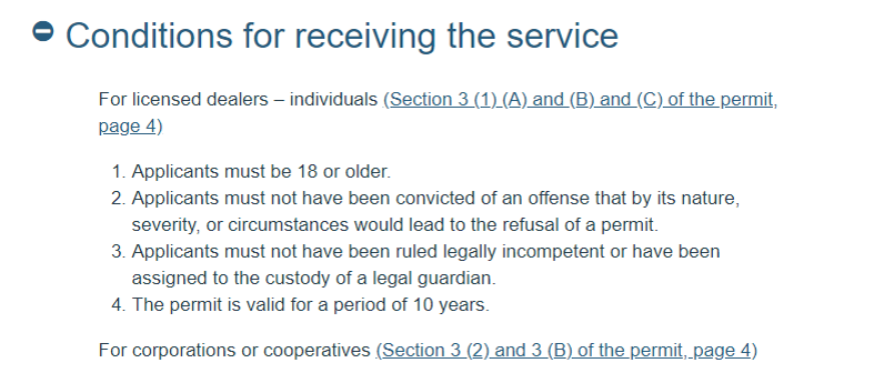
This is both obscure and bureaucratic. It’s also unspecific so, altogether an unclear way to say something pretty simple:
Who can apply and what you need
See how clear it is:
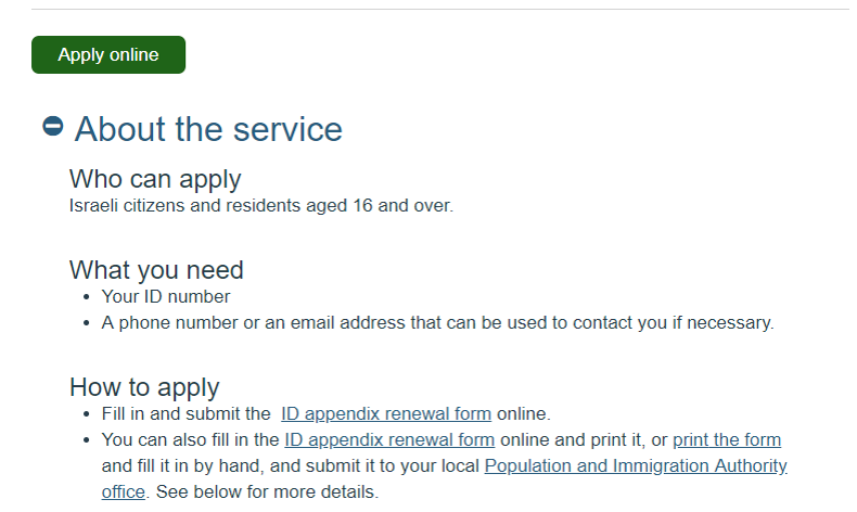
Anyone scanning the page will understand it immediately and quickly find the information they need.
Because “Conditions for receiving the services” is not everyday language, simply reading it requires an effort. You then need to figure out what it means and how it is relevant.
To sum up:
Clear content is an absolute MUST! It’s perhaps the most important rule of good microcopy, for your users to:
- Get what they want
- Get what you want them to get
- Have a positive experience and come back
CONCISE
ADJECTIVE
Giving a lot of information clearly and in a few words; brief but comprehensive.
Origin
Late 16th century: from French concis or Latin concisus, past participle of concidere ‘cut up, cut down’, from con- ‘completely’ + caedere ‘to cut’.
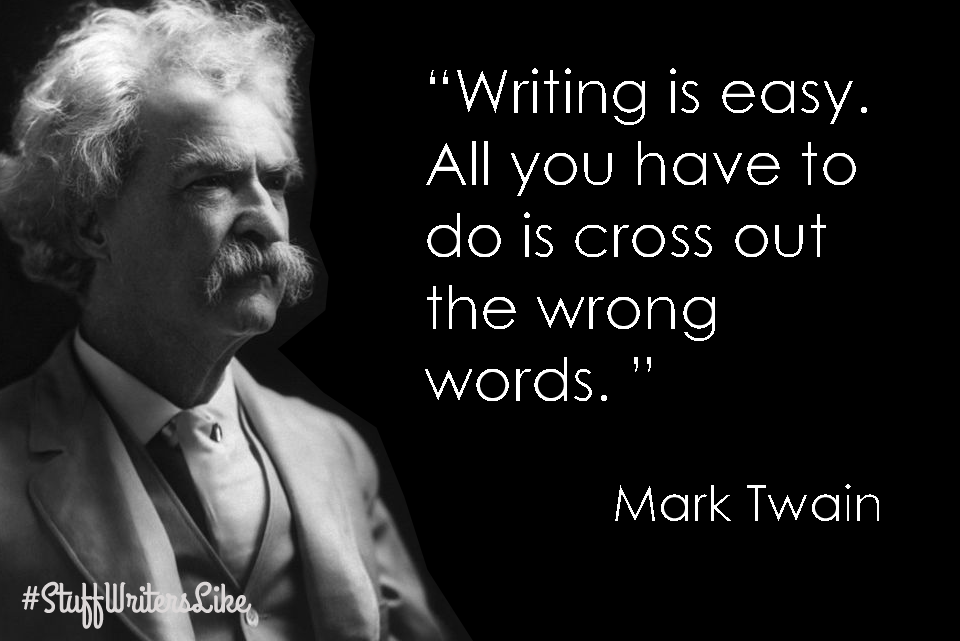
I love this definition, because of the etymology. The word originally meant to “cut up / cut down” which is exactly what you should be doing with your content.
Why should your microcopy be Concise?
Why can’t you just wax poetic all through the interface?
Because it makes your users work hard.
Writing concise content means cutting out everything that doesn’t serve a clear purpose. It’s the essence of efficiency in writing.
Microcopy essentially needs to do two main things:
- Guide the user and provide information — functional
- Connect with the user and support the brand — emotional
So, your concise content should be short without sacrificing either of these. It’s important to remember that short is a part of concise, but not the goal.
3 reasons why you need to be concise:
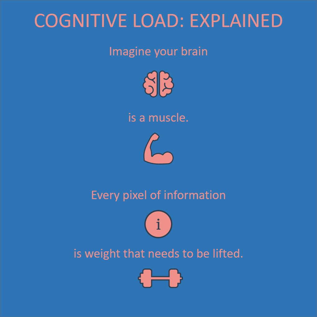
1. Cognitive load
It makes it easier to absorb the information
Cognitive load, in UX, refers to the amount of mental energy your user needs in order to understand and use an interface.
Concise means taking out all the extra information that is not essential. This reduces the cognitive load.
2. Retention
It makes it easier to remember.
Concise means cutting out everything unnecessary and breaking information up into small digestible chunks. This shortens each piece of microcopy, making it easier to retain (there’s a reason it’s called micocopy!).
As a result, your users will remember it with ease.
3. Scannability
It makes it easier to scan (find easily).
Concise copy is easier for your users to skim and scan through, because each piece of info is a short, single idea. They will go through the whole text fast without pausing to think, and collect the main points. Then go back to read in depth.
Concise does not mean the minimum number of words possible!
If adding words adds personality to your brand voice, do it. If adding words makes things clearer, do it.
Here’s an example:

Zoom could have simply written:
SIGN UP
But:
SIGN UP, IT’S FREE
works so much better.
Just two extra words takes away all the anxiety for a first time user while also subtly creating a sense of urgency that’ll hook them in.
How to make sure your content is concise:
1. Write the content.
We’ve already discussed research and vocabulary above. So don’t forget it. It’s important.
2. Cut out everything that is not essential
But keep everything that is (for your user).
You may be communicating a complicated concept. This means you should cut out everything—and I mean EVERYTHING—that’s not essential.
If it is essential, break it down into clear, simple concepts.
5 clear, concise concepts are better than one unclear, ambiguous, and lengthy concept.
3. Read it again
Read it out loud.
Read it to peers and test it on users (if possible).
4. See if you can cut out more.
Just go for it!
You want to take it to the edge to find out when you’ve gone too far. That’s how you’ll know when to stop cutting.
5. See if you have cut out too much
Now that you have really butchered it, see if it still works.
6. Make sure you haven’t sacrificed clarity or personality
Remember:
- Clarity is usually more important than anything else because it helps your users get stuff done.
- Personality is your products “voice.” It’s what the user will connect with emotionally, so it’s not just about communicating information efficiently. It must sound like the voice you have chosen for your product.
What makes your content less concise?
- Very long blocks of content
- Lots of ideas and concepts rolled into one content chunk
- Anything unclear
Here’s an example from my Google account:

There are 3 distinct pieces of amazingly concise microcopy.
This is what each one says and means:
Storage
What it means: This is how much memory you have to store your stuff.
The font is grey which is a neutral color.
13.9 GB of 15 GB used
What it means: Your storage is almost full. You have used 13.9 GB of the total 15 GB, so 1.1 GB left — not much!
The font is red which indicates urgency.
UPGRADE STORAGE
What it means: Here’s the best solution for you. Add Storage! You’re not just adding, you’re upgrading, so you’re cool!
The font is blue which indicates trust, security, and is positive, especially in contrast to the neutral grey and urgent red.
All CAPS makes the microcopy stand out even more.
So much info packed into 3 extremely concise, extremely effective pieces of microcopy.
Well done Google!
(I didn’t want to talk about formatting—the weight and color of fonts etc.—but here it’s so well done, I couldn’t resist.)
To sum up:
Concise content is information broken down into small pieces where everything unnecessary has been cut out. It is above all, efficient.
It:
- Reduces cognitive load
- Makes retention easier
- Allows the user to scan content fast and with ease
CONSISTENT
ADJECTIVE
- Acting or done in the same way over time, especially so as to be fair or accurate.
- Not containing any logical contradictions.
- Unchanging in nature, standard, or effect over time.
Consistency, in UX writing, means a set style of language and structure of content throughout an interface.
It’s usually defined in a style guide that outlines the product’s:
- Voice and tones
- Formatting rules
- Titles styles, and more
Once the user has “learned your language” (or if they already speak it) they will understand easily and quickly. Obviously, you should be designing your voice and tone based on your user group and brand.
If you change the way you communicate with your user—if you are not consistent—they will:
- Feel it on a subconscious level—something will feel odd or wrong.
- Experience it on a cognitive level—something will not make sense or will make them use more brain power.
Even if you are still clear, something may not feel right. It can be a bit like a break in trust.
Imagine if you are at your favorite club, headbanging to AC/DC and then the DJ decides to play Celine Dion. It just feels wrong. We’re not saying anything against Celine Dion…but she’s not AC/DC. It’s out of place.
It’s inconsistent.

That’s an extreme metaphor and inconsistency is usually far more subtle than that.
It could be using title case and then sentence case and then All CAPS for titles:
- Title Case is Like This
- Sentence case is like this
- ALL CAPS IS LIKE THIS
It could be using different terminology for the same thing.
A menu that sometimes uses pronouns and sometimes doesn’t, or mixes them up:
- My Documents
- Pictures
- Favorites
- MY SETTINGS
Inconsistency is bad for two main reasons:
1. It can simply be confusing
The user may not understand what you are saying because you’ve said it differently somewhere else. They’ve learned how you communicate and now your communicating differently. They will find it harder to get what they need on a practical level.
2. On an emotional/psychological level the user will feel that something is not right
They may feel that the product isn’t professional, or designed by experts, so the information or the service is not the best. It’s not just about what the product actually gives them or how it functions, it’s about how they feel—the experience.
How to keep content consistent:
1. Write the content in one voice
Use one voice across your platform.
The voice is your brand and should be based on research.
You can create a persona to help you hear that voice in your head, and design how they talk.
Every product has a different voice, in the same way that every person has a different voice.
2. Read your content out loud
Yes. We’ve seen this before. It’s always helpful!
3. Check your style guide
You should write according to a style guide that clearly defines your product’s voice and tone and outlines the writing guidelines and rules.
Keep referring back to your style guide, as it is there to help you stay consistent.
If you don’t have a style guide, you can use existing style guides. This saves time and with good style guides a lot of the work has already been done.
However, your content should be unique and reflect your brand voice, so be careful. You can’t assume that what works for one product will work for your product.
Check out the Top 14 Content Style Guides 2021 (and How to Use Them) to find some great style guides.
Let’s look at an example of inconsistency:
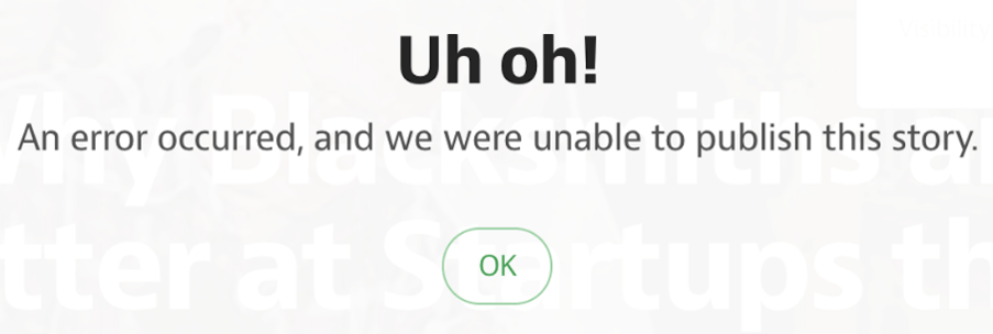
I find this to be a great example of inconsistency.
Let’s break it down:
Uh Oh
It sounds: Casual, cute, goofy, natural, spontaneous (but also a bit like a warning).
I’m imagining: A child.

An error occurred…
It sounds: Technical , robotic, passive—who is talking?
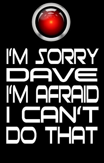
I’m imagining: Hal from 2001: A Space Odyssey…although Hal had a bit more personality.
…and we we were unable to publish this story.
It sounds: Polite yet passive. “It’s not really us” (which kind of implies that it’s you).
I’m imaging: A publishing agent politely informing me that my poem has been rejected.

This microcopy switches between a child, a robot, and a bureaucrat. There is no consistency, and I have no clear image in my mind.
(On a side note, as error messages go, it’s also pretty unhelpful).
I would write it something like this:
Sorry,
we couldn’t publish your story because of a problem on our side.
Try publishing again
I’m imaging a youngish adult who is apologetic yet helpful. They’re casual and respectful. Throughout the error message there is one voice and tone.

I’d have to know more about the product voice and target audience to get it really good, so at the moment I’ve left it quite neutral (I think it’s from Medium). We could try and add some humor here, but “Uh oh!” isn’t what I want to hear when something I worked hard on went wrong.
A final word about consistency:
Consistency is not the same as uniformity
Uniformity is when you have a rule that must be adhered to no matter what.
In the same way that “concise” does not mean “short”, “consistent” does not mean uniform.
Don’t believe me? Check out what GOV.UK has to say about it…and we’re talking about the British government. A country that still has school uniforms and a queen!
Here’s a way I like to think about it:
Imagine a product that is like an apartment that has been designed consistently but not uniformly.
Moving from room to room, you feel an overall connection and harmony (even if you are not aware of it). The kitchen is not the same as the bedroom.
They have distinctly different functions and fixtures, so they are not uniform. But every room feels part of the whole. They are consistent.
Uniformity would dictate that each room has the same function, which for an apartment (and a platform), would make absolutely no sense.
Summing up the 3 C’s of UX Writing
The 3 C’s of UX writing are:
- Clear
- Concise
- Consistent
They are absolute musts to make your copy work well for your users.
Writing clear, concise, and consistent microcopy will make your users’ experiences better, and make you a better UX writer, which is what it’s all about.
Asaf Shahar is an English UX Writer for Israel’s ICT Authority E-gov Unit
He likes fixing things that don’t work well.


