Creating microcopy for mobile video games sounds simple in theory. Most mobile games are practically the same, right? There’s usually a tutorial, a leaderboard, a store with descriptions. Maybe some in-game dialogue. How complex can it get?
Ridiculously complex, as most UX microcopy challenges tend to be. Not only do you have to ensure that copy is concise and useful, it should also fit in with the narrative design of the game as much as possible to give the player an immersive gaming experience. The goal of UX microcopy is a positive user experience and UX writing for video games goes one step further than that — create a positive user experience that is also FUN. Because if it isn’t entertaining on some level, no one’s going to keep playing.
My company currently has two games in development and as the sole writer, I’ve been researching, (aka playing games) nonstop to look for best practices and positive gaming experiences across genres. Since our games are still in development, I had two goals when I started my research. First, I wanted to analyze the microcopy on the menus and any pop-ups. Second, I wanted to learn which sort of tutorial microcopy is the most effective and clear across genres. For this article, I’m going to break down some tips based on what I’ve observed so far using five mini UX writing case studies that each focus on a different game. (Since this is game focused, I’ll also be referring to the user as the player.)
1. Keep the Microcopy Minimal – Bubble Witch Saga 3
After listening to a very insightful podcast from UX writer Mario Ferrer, I promptly went and downloaded a slew of King games on my Android. Now, I should state that I don’t like a lot of busy UI’s in any game I play because I’m the type of player who finds noisy screens very overwhelming. If I can’t guess what the icons are or they’re all over the place with too many colors or movement, that’s a negative experience for me.
While many of the King games are bright and bubblegummy, Bubble Witch Saga 3 is clean, concise, and fun to play. Since I knew that King Studios has a dedicated UX writing team, I was curious to see what that translated to on-screen. The game jumps right into Level 1 with a pop up that explains the goal of the level in exactly three words.
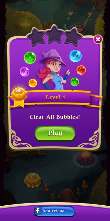
This continues through-out the game, no matter the level. Since there were different goals at different levels, this made sense and was very helpful for me as the player to know what to expect. There were no extra or superfluous words anywhere.
Next, I was looking for store or shop icons. One of the biggest things I noticed about the UI design across most of these games was that there often is no store icon. Bubble Witch follows this trend. On the top right, there’s an icon displaying the amount of gold bars the player has. Tap on that and it goes right to the store where, again, there are hardly any words. Super simple, nothing extra or confusing for a player.
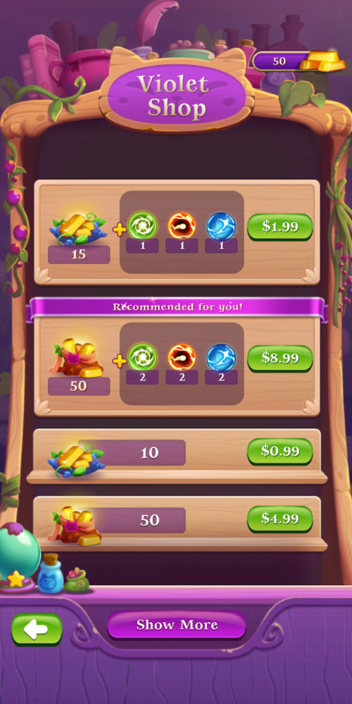
The shopping experience on a mobile game will depend a lot on the developers and the game designer but if UX designers and writers are involved from the beginning, then I feel like it’s part of the UX team’s job to ensure that the store functions are kept as simple as possible to avoid player pain points. Bubble Witch Saga 3 does exactly that.
2. Small Details Can Help or Hurt – Angry Birds 2
In Bubble Witch 3 Saga, not only is the microcopy concise and effective, it fits in with the narrative design of the game. (Narrative design is the interactive and immersive storytelling experience of the game.) When you beat a level, the game proclaims “Magical!” which is perfect for a game about a witch. Now, if everything in Bubble Witch ties back into the narrative design, then nothing in Angry Birds 2 connects it to the overarching narrative.
For example, you can upgrade your angry birds’ smashing ability by earning (or buying)…hats? I’m still trying to find out what hats have to do with birds and pigs. There’s also leveling up for the slingshot, for the card (again, what does this mean?), and for your hatchling. I didn’t play a lot of Angry Birds 1 so maybe I’m missing out on all the references. Or maybe the teams at Rovio just didn’t care that none of the upgrades make sense nor do they relate to birds or pigs in any way.
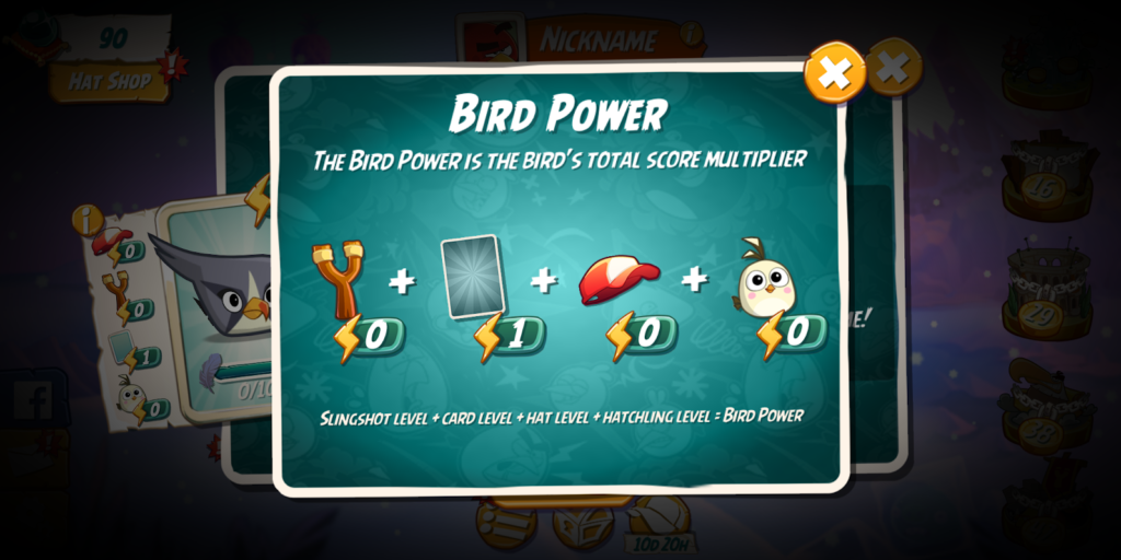
Another example of the disconnect between the narrative design and the microcopy is the use of the word “rooms” in the game. A “Room” is a term used by game designers and developers to describe the different areas or scenes within a game. (Having different rooms within in levels makes it easier for developers to change background or images or level mechanics, etc.) In Angry Birds 2, the levels have two rooms each and there’s a pop up in the tutorial that explains this to the player.
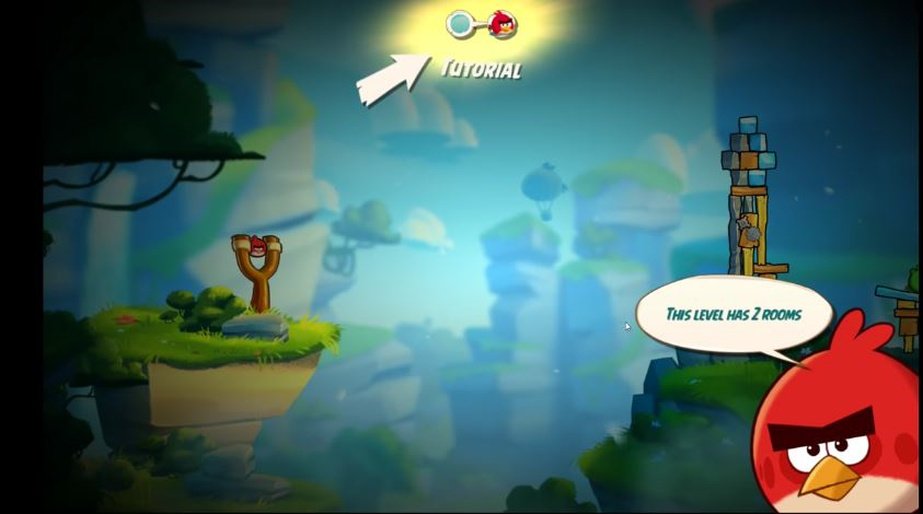
As you can see, the bird actually calls them rooms. This confused me to no end when I started playing. There weren’t any walls and nothing in the game looked like a room. After our game designer explained to me what a room meant for game developers, it made more sense but from a microcopy & UX standpoint, why wouldn’t you rename them to be more related to the story of the game? Areas, zones, parts, regions, sections. There are so many options other than the very confusing and slightly jarring “rooms.” This was a missed chance for Angry Birds to immerse players even more into the game’s story.
3. Simple Doesn’t Mean Boring – Alto’s Adventure
Of all the games I tested, Alto’s Adventure has the cleanest UX design and microcopy. Foregoing the use of oddly-shaped boxes or over-bright colors, the game’s UX is all plain text with very little else. Every menu, every word is the simplest it could be while still matching the overall art style of the game, starting with the tutorial.
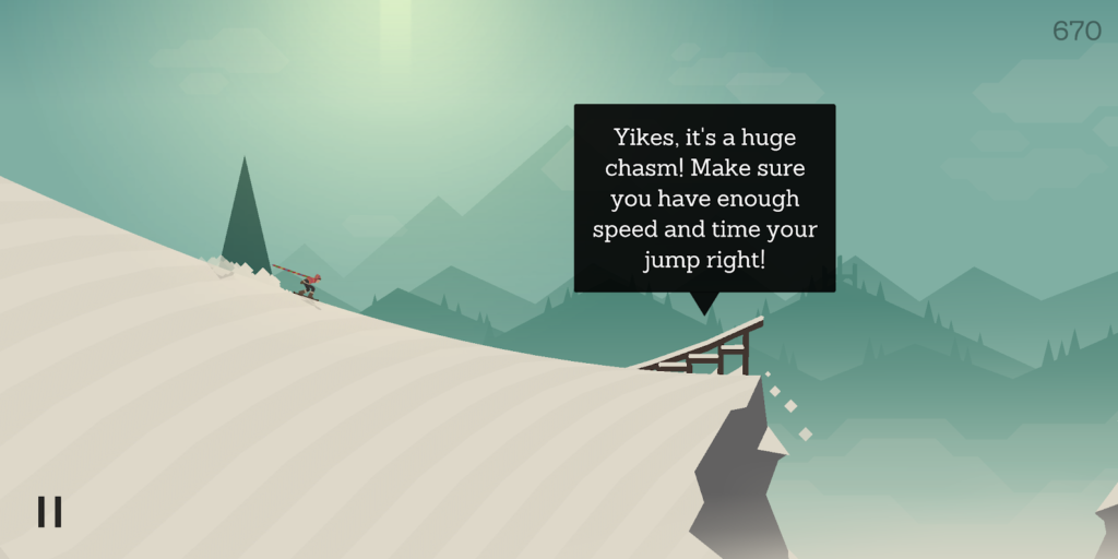
This was a really good reminder on what the purpose of UX writing for video games is supposed to be. The microcopy usually isn’t the focus of a game; it takes a backseat to the game itself and can serve two purposes: to enhance and support gameplay or to disrupt it. Alto’s Adventure is a case where it almost never causes painful disruptions or negative experiences, even when I fail to jump over the rock for the eighteenth time. I keep waiting for the abominable snowman from Ski Free to come eat me every time but instead I’m rewarded with calm menus and simplistic text.

To me, this use of clean copy with no colors, boxes, or graphics calms my brain after the fast nature of the gameplay. So, even though I’m fairly stressed the whole time I’m actually playing, I keep coming back to this game because the rest of the UX, especially the microcopy, is so zen-like I can’t help myself.
4. Give the Players What They Want – Super Mario Run
I should probably have a disclaimer here that Super Mario Brothers is one of my favorite video games of all time. How excited was I when I discovered there was a mobile Mario game? Very. Which made the disappointment after getting into the game that much worse. While it was difficult trying to play Mario without my Super Nintendo controllers, the biggest problem with the game’s UX was the overabundance of microcopy. Even before the game actually started.

Once you begin the gameplay tutorial, there’s a pop-up every time a new skill is introduced. And each of those pop-ups contain descriptive text with long sentences. Most of which, I quit reading after a while. Once I got used to the controls, I didn’t hate the gameplay as much but the UX was still overwhelming, especially right after the world level tutorial because I was then forced to play a rally level. And then forced to get some decorations for my kingdom. Which was then followed by three long pop-ups about collecting certain numbers of this or that and gaining more characters.
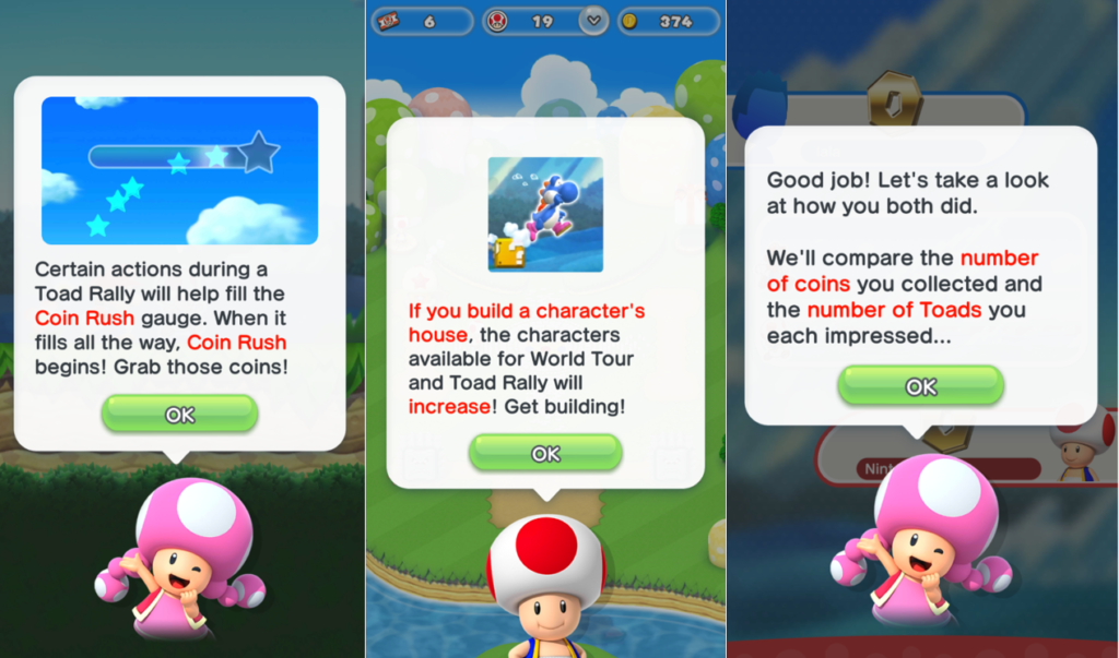
Finally, there were even more pop-ups about my daily gifts available and a new type of level to play. At this point, I just wanted to check out the store or get back to the world map. As a player, I was highly annoyed that I had a specific goal but the tutorial kept throwing information at me, one pop-up after another.
One of the most important points when it comes to UX design and mobile games microcopy — don’t take the player away from gameplay for too long. It’s a pain point when they just want to begin the next level but instead have to learn the ins and outs of every single game function in one sitting.
5. Directions Aren’t For Dummies – Board Kings
If Super Mario Run had too many interruptions to explain gameplay, then Board Kings has too little. Board Kings can be a highly addictive game to be honest, but in the same breath, I don’t really understand the point of the game. When you load it up for the first time, there are hardly any directions. In fact, the only pop-up with some sort of instructions or explanations simply says “This is your board.”

And that’s it as far as microcopy goes. The game simply starts. I sort of slowly figured out how things worked but I never did understand the purpose of rolling the dice and upgrading the spaces on board. What do I gain out of this? After playing for a week or so, it seemed that there was no point beyond upgrading the board. As you do this, the game introduces new elements like mini-games and cards and albums and a never ending slew of activities and games-within-games (that also didn’t always make logical sense or relate in any way to an overarching story). All to keep you coming back to the game.
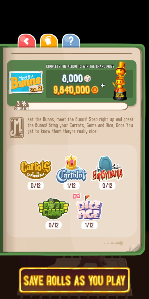
Now, the microcopy across all of these options is concise and usually effective despite the overwhelming game options. But as far as tutorials go, there really wasn’t one. Now, not all games need a tutorial but all games have a purpose or a goal which should be communicated to the players in the simplest form possible. And if it’s not through playing, then that’s where the UX writing for video games can really shine or, in the case of Board Kings, fail. Dumbing down the directions to nada doesn’t really enhance user experiences.
– Conclusions & Final Thoughts –
Diving into mobile games and UX writing case studies really drove home the importance of mobile games microcopy. While users might put up with frustrating or poorly designed apps because they use them to pay bills or do some other life necessity, games are completely optional to use.
If there’s something amiss with the UX, from the design to the microcopy, players will give up on a game just like that. Just like other cases of UX, it all comes down to researching what do users, or players, want. Do you play mobile games? Have any UX writing preferences or tips for game development teams? I’d love to discuss and learn more.


