Whitespace is usually a good thing. If you’d ask me, I’d be the first to advocate for more whitespace in the interface. However, sometimes it’s better to use the space you have to help people understand what the best and easiest way to use your product is.
Overview
SignNow is a cloud-based platform for handling electronic signatures. You can add different types of fillable fields to the documents, make document templates, create groups, invite teammates, and other cool stuff.
SignNow is easy to use and pretty straightforward—but that’s just my opinion. Some people, however, get confused when they first start using it which is exactly what we were trying to fix.
The Challenge
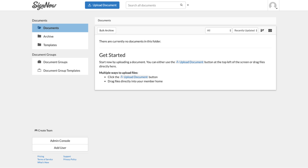
In the beginning, SignNow’s homepage had 2 panels.

One was at the top with an Upload button and the other one on the left with a list of document folders. Our guess was that the button was so small, lots of people didn’t see it and got confused.
And when I say lots of people, we’re talking about 30% out of those who uploaded documents. Truly, that’s a lot.
Another challenge was that even for those who managed to find the button, they didn’t know what to do next. They uploaded their document and thought it was already sent for signing. Our goal was to help people easily navigate through the homepage and have a general understanding of what they should do next.
The Solution
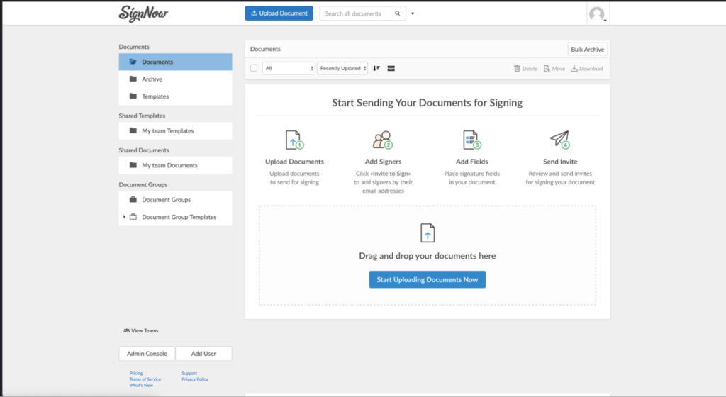
We needed people to upload their documents right away. That’s why we decided to create a bigger button in the middle of the screen. But not just the button. Since we needed people to have a broad understanding of what they should do after they upload a document, we came up with a 4-step sequence guide.
Its purpose was to guide them through the process from the point they upload a document up to when they send it to the signers. Eventually, we got a card in the middle of the screen with a 4-step sequence of actions and a massive blue button that invites you to upload your documents.

The Process
To encourage more people to upload their documents and send them for signing, we worked in a team of designers, business analysts, and a writer (that’s me).
The designer made a sketch and I wrote the copy. I needed it to be concise, clear, and useful so that anyone would be quickly able to realize what’s going on there and understand what to do next.
We had some discussions with business analysts on the length of the button copy which resulted in “Start Uploading Documents Now.” I actually would have shortened this to “Upload Documents Now,” but at the time we had our reasons to leave it as it is.
And guess what? It worked!
Results
According to the A/B tests we ran during a 3–4 week period, the new homepage view won. The number of documents sent for signing increased by 12%. We did what we aimed to.
People finally began to understand what to do after they uploaded a document and how to get their documents e-signed.


